Flourish Data Visualisations
Tuesday 10 August 2021 |
Category: Web
There are now many brilliant Javascript-based tools for interactively displaying data. One which had recently caught my eye recently was Flourish, which requires no coding knowledge and has an impressive free package with many very advanced visualisation.
Flourish caught my eye recently due to it’s use by an impressive line-up of organisations including the BBC, Amnesty International, Google, Sky, the FT, GSK, and dozens more household names.
Again, though Flourish is JavaScript based (i.e. interactivity is created by a script running in the background), creating interactive graphs with it requires no coding knowledge. Out of the box, the free account offers all of the key features you could really want or need – for example, all of the visualisations below are created from my own Free account. Furthermore, it offers over 100 different interactive visualisation types out of the box (screenshot of all options available provided at the bottom of this page).
I provide some of the more impressive Geographically relevant visualisations below with a short of description of how they work and some initial thoughts.
Country per capita CO2 use (3D graph)

[Data from above: Worldopedia]
The underlying data comprises a data table:
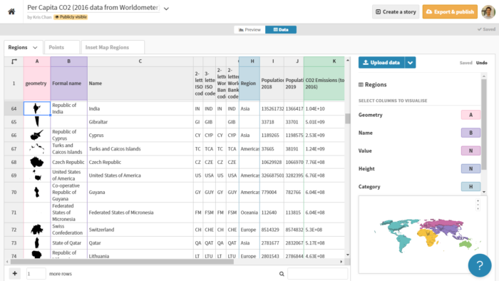
Data tables for maps are sorted into Regions (e.g. the outlines of this map), Points, and Inset Map regions – neither of the latter 2 are in use above.
Note that the shapes which form the country outlines are in fact GeoJSON multipolygons rather than being from a GIS-based file (.shp or other). For those unaccustomed to web development, this is basically a list of points that form the outline For example, Nauru is:
{“type”:”Polygon”,”coordinates”:[[[166.938813,-0.490411],[166.906993,-0.524835],[166.938813,-0.551853],[166.958263,-0.517673],[166.938813,-0.490411]]]}
This can be a bit of a pain to work with but I managed to quickly use Excel’s VLOOKUP to match the Worldometer climate data with the country ISO codes to match the data. Note that data was not available for every county, but I chose to retain the missing data country outlines for demonstration (e.g. New Zealand).
Other formats are available,
Hex Map
The above is an Great Britain ‘hex map’ provided as a template from Flourish (i.e. the data is meaningless). As a hex map, clearly though the shape is generally recognisable as Great Britain, constraining the Parlimentary constitutions to regular connected hexagonals distorts the shape and relies on ‘fudging’ the locations.
A global inset map was added for demonstration purposes and the data table resembles the same chart as above, with the hex locations defined as GeoJSON multipolygons:
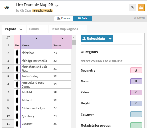
The above also provides a better indication of how the data is set, with columns being assigned in the regions tab (or points if using points).
Summary
Flourish provides a really impressive option for web amateurs to get visualising data interactively without the need for coding. I’ve focused on more Geographical options to test their potential and explain briefly how they work, though over time, I hope to add more visualisations to this page (when they happen to be useful for research or teaching).
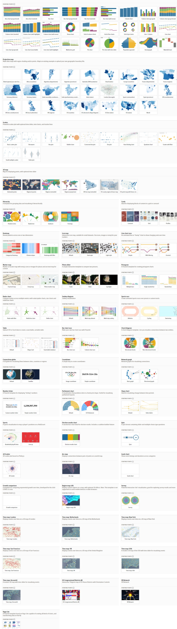
As shown below, Flourish offers a vast amount of visualisations, including harder to make visualisations such as Sankey diagrams, chord diagrams, time maps, radial trees, etc. Overall I would strongly recommend for students and researchers, even as a potential alternative for standard graphing packages.
Full list of template visualisations
Below is the list of available templates for immediate use as of 10 August 2021. Note however that the option to create custom visualisations however also exists for those web savvy.