24hr to implement sensor & dashboard
Thursday 5 July 2018 |
Category: Open Hardware
Inspired by Dr Thomas Smith (LSE) who has engaged students to design environmental data dashboards, Kris decided it was time to implement his own live data dashboard.
With teaching, field-research and conferences, time has been woefully short. I therefore set myself a challenge: to set up an automated environmental logger which saves data to a student-friendly format (Google Sheets) whilst also developing a “dashboard” front-end to display the data.
Click here if you just want to see the dashboard
Whilst this sounds daunting to newbies to open-source technology or the “Internet-of-Things”, this was not my first time playing with scripts, ‘APIs’ or internet-connected devices. Though I had some success posting data onto Google Sheets, visualizing the data amounted to creating a Sheets graph and providing a jazzed-up link to said graph..not exactly awe-inspiring.
Being cognoscente of having limited time, I doubled-down and chose to additionally test the BME680 sensors, which I’ve planned for the entire cohort of Physical Geography students to make Arduino loggers with next term.
Here’s the idea:

First step: wiring the BME sensor to a Particle Photon
A Photon (pictured above) is a wifi-enabled microcontroller (basically a programmable micro-computer) made by Particle.io . The Photon is connected to wifi extremely easily with a few taps on a smartphone. Other wifis may not be as easy (Eduroam is impossible with certain devices). To clarify, the smartphone is only used to very quickly set up the Photon – the phone is not used to connection to the internet over it’s mobile reception, though it can be.
Programming of the Photon is done online with the script sent to the Photon over-the-air. Particle has been actively adding more libraries on their programming platform, and they now provide one for the BME680. Using the library, it was very quick to get data sending to the cloud, albeit just to Particle.io
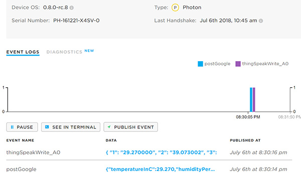
BME680 data being received by Particle.io
Step 1 complete. Step 2: get data uploading to 
Having encountered issues in the past with IFTTT (If this, then that) and ThingSpeak (2 “beginner friendly” data forwarding, recording or displaying services), I had amended an existing code to accomplish this using Google Script and Pushingbox. Playing around with this, it required an html request (put simply the Photon tries to access a specific URL, the specifics of the URL then publishing the data to the Google Sheet). There was however an issue, as the Photon can only deliver a URL of a specific length – equivalent to just posting about two data variables max.
Searching, I discovered other new tools. First was a new web app from IFTTT. Whilst this worked, there was a limit on the number of posts you can create a day. After searching for what this number was, I am left none the wiser, suffice to say it was not a lot. It furthermore required a fair amount of buy-in to learn how to code the variables into separate columns on their platform, which given the previous point, I was not about to do.
Next, I found a Particle library for ThingSpeak. This was easy to implement, created graphs quickly, but a) acquiring data off ThingSpeak requires creating another server script, and b) unless coding with Matlab (which I have very limited experience but seems very similar to R) the graphs are basic and not really worthy of being a serious contender for an aesthetically pleasing dashboard – see dashboard.
Back on the search, the Particle forum provided dividend in the form of a “webhook” code (an instruction to the server which explains what to do with the data. This is basically the same as an API). After some jiggery code-pokery, the Photon was uploading to Google Sheet – the only limitation being you can’t publish more than one set of data per second. Instructions for how to do this can be found in this Github repository.
Step 2 complete. step 3: creating a data dashboard which calls the data and visualizes it.
Dr TELS provided some useful pointers for where to begin with making the dashboard: Tableau and Google Data Studio. As King College London however has a subscription to the premium Microsoft Power BI dashboard creator, I decided to give it a try. I quickly managed to get Power BI to download data from Sheets, though it proved too difficult to retain the live data transfer from Google Sheets without going down the rabbit-hole of significant coding.
I weighed up my options; Tableau certainly seemed capable of doing this, though it required installation and a few too many clicks for it to be truly intuitive to students. I therefore turned to Google Data Studio.
Data Studio was relatively easy to connect with the Sheet data and set-up simple graphs. Visualization options were a bit limited however, and there were a few other minor gripes (page sizing in pixels instead of % no automatic refreshing of the data without clicking, limited options for time, Google Sheet’s limit of 2 million cells, etc). That said, it provides a range of visualization options, notably MAPS which I’m keen to explore more later.
A major gripe however was the caching of data only when the Data Studio administrator manually clicked refresh, something I only noticed a couple of days later when not logged into Google. It turns out Google store the data twice – once for Sheets and again for Data Studio. This unexpected issue effectively led to the the same issue as Power BI, albeit slightly quicker to rectify. The issue is explained in greater detail on this blog.
Thankfully the blog also proposed a workaround:

Brilliant Giphy reference
ANNDD another more ‘workable’ workaround, using a Continuous Integration Server (CIS) – basically a digital, more flexible version of the above. The catch? You need a server (or online computer) to run this.
Unfortunately I don’t own a server and ran out of time to implement this on my computer (or multiple computers which may be running at any one time as my computer gets turned off) so will have to come back to this at a later date. The irony of using a computer or server to update data from a low-cost sensor is not lost on me, and automatic Sheets integration does appear possible on Tableau (only overnight for the free version). However I was keen to try the CIS method as 1) I like learning new things, 2) I could do with a server anyhow (long-term plans, though short-term this might just involve setting up a raspberry pi server), and 3) the sunk cost fallacy having already put the time into making the Data Studio dashboard.
INTERACTIVE semi-final result – expand via bottom right:
ThingSpeak Dashboard (updates real-time)
Challenge not quite completed
Concluding remarks/what have we learnt?
1) The particle photon is a brilliant piece of kit – easy to work with provided you have some Arduino/C++ knowledge and the library or documentation you need exists. This is an important point – other lecturers in my department have found neither to be as substantial as they would have hoped. Projects can also be made ‘mobile’ by simply flashing the code to a Particle Electron. Webhooks can easily be created on Particle.io, saving the need for using third-party web-forwarding services.
2) Google data studio is easy to use for personal use, though is slightly harder for public access. The design of a real-world application dashboard using it seems like a great student project, though be aware of the wifi connectivity issues mentioned previously. Data requests not covered by the UI are however quite a bit harder to implement and really have to be done in Sheets (e.g. last value). I also recommend creating two Sheet documents; one for the sensor data to be logged to and a separate one just of data you want shown to help get around the currently limited UI. Some point in the future I will create a Tableau version for comparison. Whilst PowerBI can likely link to the live data via some complex API, it seems a bit too much of a headache to implement. Other web-orientated versions also exist (e.g. Bootstrap’s “Admin dashboard” or javascript-based graphs like that used in the Spectral Explorer) which again can be linked to sheets, but these are really specifically designed for web developers.
3) Using Google Apps Script to parse data from Particle.io to Sheets has some other key benefits including tracking the number of times the script is run, the failure rate, and tracking of different version histories:
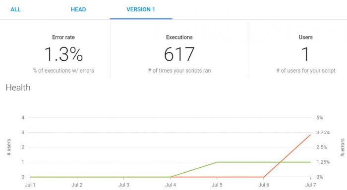
Google App Script Dashboard
4) ThingSpeak offers a brilliant free service for creating live public data visualisations. Matlab is well integrated to create more complex graphs than the very limited quick options.
5) Ensure you adequately test new sensors. Whilst the set up works perfectly, the BME680 sensor has been creating a few issues (see below). Ultimately testing the sensor was part of the purpose of the exercise and troubleshooting now will save a lot of headache later.
Logger Update – 15 Aug 2018
After some initial teething issues, the logger has been running great for a couple of months now. I’ve added a PM1, PM2.5 & PM10 sensor as I had to test whether this would interface with the Photon. Issues encountered (& workarounds) were:
– BME680 continually stopped working when interfaced via I2C. Swapping to SPI rectified the issue
– VOC readings sometimes fail. This appear to happen more often during busy internet times. Solution: repeat VOC readings up to 5 attempts. I’ve started logging the number of failed attempts; often it is successful after the second attempt, though very rarely it fails even with 5 attempts.
Some of the issues have been reported by others, including the gas reading steadily rise over multiple readings and gas resistivity dropping to 0. This is frustrating given the robustness of Bosch’s other environmental sensors (BME280, BME180). If interested in BME680’s “quirks” you should also check out this github forum.
Final ramblings (/Pro design tip):
Having done design in the past, I am aware that the colour scheme ignores the trend for dashboards – dark background and subdued biolumiescent colours (for the purposes of attracting squid, or something along those lines). Having tried a dark background dashboard, it clashed badly with the light background of the site, and I lacked the time desire to make the page background darker.
If you have a thing for calamari, you can accomplish the same effect by using a night-time reading extension on your browser:
